So many new generation businesses are emerging in recent years, often catering to a niche market yet with a high potential for growth and expansion. The advent of high end mobile networks and handheld smart devices in addition to deeper internet penetration means that this will only continue in the medium term. So what does it mean for web developers? Clients hire a dedicated programmer with the motive of developing decent web applications that drives their business. At least, that was what was expected out of such projects – until now. Nowadays, clients want more from their websites, given that there is intense competition on the internet. Amidst the clutter of online businesses, if the customer wants to take notice of your client’s website, then we certainly need to step up our game – beyond just coding for requirements or the usual HTML and CSS duo. In this blogpost, we provide some insights on how to design awesome websites for your client and give them an edge over their rivals. While a great website must deliver on all counts right from speed and performance to accessibility, in this post, however, we will be restricting ourselves to the visual part of the website.
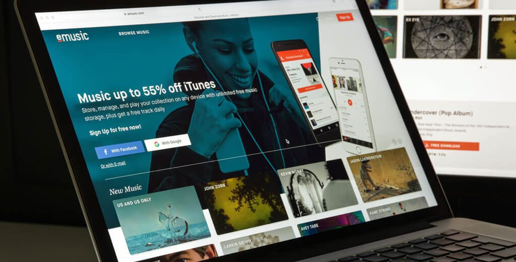
Your client’s business, in reality, may deliver on their product offerings in the best manner but in this era of online marketing, if their website’s layout is bland or unappealing, customers would fail to visit it, let alone making a purchase. Therefore, at the outset, we make the case for using an attractive colour palette that compels the customer to visit and stay in the client’s site. Choosing one is not really difficult, if the client is clear about her brand and its positioning. The colour palette must seamlessly align with the main message that the brand wants to convey in an attention grabbing manner. For instance, Apple’s website never ceases to catch our attention with their clean, minimalistic layout coupled with macro pictures of their products and short phrases. This brings us to the next key component – images.
Let’s not forget the power of images. They can convey so much if displayed in the right manner. How is it that your client wants to exhibit his company? The answer to this question will enable developers to select the right image(s) for the client. Sky is the limit here and there is so much room for exhibiting flair. So get your creative juices flowing. The images must resonate and engage with the customer. The client is free to proceed even with just texts. The website’s design can also double up as what the client has in store for the customer – from the point of view of customer themselves. If the client is a tour operator, then she can exhibit vivid testimonials from existing customers of their travel experiences.
Then we have whitespaces which can be used quite effectively when clients want to drive home a particular point to the customer. It brings about focus to the main theme, thereby contributing to the customer staying longer at the webpage. Finally, we have the most crucial factor from a business point of view – the call to action buttons. It makes sense therefore to highlight them, resize them, contrast them and do everything in your effort to steer the customer’s eyes towards it. The CTA button can also be designed to align with the overall theme of the website. The client hiring a dedicated developer will invariably see these reflected on her website without frequent meetings.
Having gone through our guide to crafting awesome websites, what more do you think can be implemented to spruce websites? Leave us your comments below.